OWL (Odoo Web Library) is a JavaScript framework used to build and develop interactive components for the Odoo web interface.
A very common use case for OWL is the development of a custom field widget. The field widgets provide developers the ability to customize the rendering or behaviour of an existing field in Odoo without changing its underlying model/business logic.
In this blog post we will introduce the main concepts of OWL and demonstrate how to develop, register and use a custom field widget in Odoo 19 using OWL. It will also cover reactive state management, lifecycle callbacks, Odoo services, patch(), and best practices for development.
1. What Is OWL?
OWL (Odoo Web Library) is the JavaScript framework used to develop components within the Odoo web interface. The framework follows a component-based approach wherein each component can have its own template, attributes, properties, state and behaviour.
Some of the main features of OWL include:
- Component classes: Reusable JavaScript components that represent UI elements.
- QWeb templates: OWL uses QWeb templates, based on XML, to describe the user interface of a component.
- Reactive state: The useState() hook enables components to maintain reactive state. Whenever the state changes, the component automatically re-renders, ensuring that the user interface is updated accordingly.
- Hooks OWL provides hooks like onWillStart(), onMounted(), and onWillUnmount() to control component behaviour at the different stages of its lifecycle.
- Registry system Odoo uses registries to expose components, field widgets, services and other extensions to the web client on the frontend.
The basic integration flow for a field widget is:
Odoo View > widget Attribute > Fields Registry > OWL Component > QWeb Template > User Interface
This component-based approach reduces the need for direct DOM manipulation and provides a structured way to develop and maintain frontend customizations.
2. Creating an OWL Widget
A simple custom widget module can use the following structure:
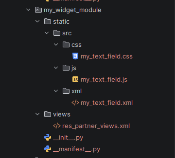
The JavaScript file contains the OWL component, the XML file contains the QWeb template, and the view file applies the widget to an Odoo field.
Adding Assets to the Manifest
The JavaScript and XML files must be included in the module's asset bundle.
# -*- coding: utf-8 -*-
{
   "name": "My Custom Widget",
   "version": "19.0.1.0.0",
   "depends": ["web","base"],
   "data": [
           "views/res_partner_views.xml",
       ],
   "assets":
       {
           "web.assets_backend": [
               "my_widget_module/static/src/js/my_text_field.js",
               "my_widget_module/static/src/xml/my_text_field.xml",
               "my_widget_module/static/src/css/my_text_field.css",
           ],
   },
   'installable': True,
   'application': False,
}
The web.assets_backend bundle makes the widget assets available in the Odoo backend.
3. Creating the OWL Field Component
For this example, the custom widget will be applied to the Phone field of a contact.
/** @odoo-module **/
import { Component } from "@odoo/owl";
import { registry } from "@web/core/registry";
import { standardFieldProps } from "@web/views/fields/standard_field_props";
export class MyTextField extends Component {
   static template = "my_widget_module.MyTextField";
   static props = {
       ...standardFieldProps,
   };
   static supportedTypes = ["char"];
   onInput(ev) {
       this.props.record.update({
           [this.props.name]: ev.target.value,
       });
   }
}
registry.category("fields").add("my_text_field", {
   component: MyTextField,
});
There are several important parts in this example.
Component:
The component extends OWL's Component class. This provides the basic functionality required to create an OWL component.
Template:
static template = "my_widget_module.MyTextField";
This connects the JavaScript component to its corresponding QWeb XML template.
standardFieldProps:
Field widgets receive standard properties from Odoo's view system. These include information such as the field name, record, current value, readonly state, and other field-related properties.
supportedTypes:
static supportedTypes = ["char"];
This indicates that the widget is intended to be used with fields of type char.
Updating the Field:
this.props.record.update() is used to update the field value in the current Odoo record when the user enters a new value.
4. Creating the QWeb Template
The JavaScript component requires a corresponding QWeb template.
<?xml version="1.0" encoding="UTF-8"?>
<templates xml:space="preserve">
   <t t-name="my_widget_module.MyTextField">
       <div class="o_my_text_field">
           <label>Custom OWL Phone Widget</label>
           <input
               type="text"
               class="form-control"
               t-att-value="props.record.data[props.name] || ''"
               t-on-input="onInput"
           />
       </div>
   </t>
</templates>
The template defines how the custom field widget is displayed in the Odoo user interface. It connects the OWL component with the HTML structure that users interact with.
The following OWL/QWeb directives are used here:
- t-name defines the unique name of the QWeb template and connects it with the template specified in the JavaScript component.
- t-att-value dynamically sets the current value of the Odoo field in the input element.
- t-on-input listens for changes in the input field and calls the onInput() method defined in the JavaScript component.
The function will be called when the user either adds or modifies the telephone number. After that, the updated data is stored within the record through the use of the update() function. This helps the custom widget to interact with the Odoo field without making any changes to the model itself.
5. Registering the Widget
Once the OWL component and the corresponding QWeb template have been defined, the next step is to register the widget in the fields registry of Odoo.
The fields registry provides the Odoo view system with the ability to recognize the custom widget, thus allowing it to understand which component should be used for rendering this widget when it is assigned to a field.
The widget is recognized via the registry key my_text_field. It is this registry key that will be used when assigning the widget to the field in XML views.
It is important to use a clear registry key to avoid possible collisions with other widgets provided either by Odoo or third-party modules.
6. Using the Widget in an Odoo View
After the widget registration, it becomes possible to use the widget for an existing Odoo field by setting the widget attribute.
In this case, the custom widget my_text_field will be used for the Phone field of the Contact form.
For example:
<?xml version="1.0" encoding="UTF-8"?>
<odoo>
   <record id="view_partner_form_my_text_widget" model="ir.ui.view">
       <field name="name">res.partner.form.my.text.widget</field>
       <field name="model">res.partner</field>
       <field name="inherit_id" ref="base.view_partner_form"/>
       <field name="arch" type="xml">
           <xpath expr="//field[@name='phone']" position="attributes">
               <attribute name="widget">my_text_field</attribute>
           </xpath>
       </field>
   </record>
</odoo>
The XML view inherits the standard Contact form view and applies the my_text_field widget to the existing Phone field.
When Odoo loads the Contact form, it finds the my_text_field widget in the fields registry and uses the corresponding OWL component to render the field.
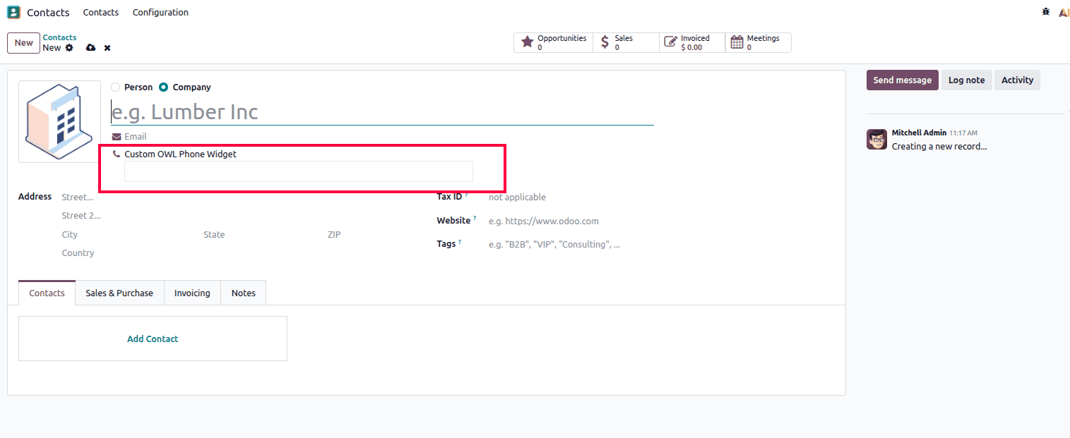
The above screenshot depicts the custom Phone field on the Contact form. This field is drawn using the custom OWL widget while utilizing the same existing res.partner model and Phone field.
This illustrates how an OWL field widget can change the user experience of an existing Odoo field without introducing a new model or any change to the business logic.
7. Reactive State with useState()
OWL provides the useState() hook to manage reactive data inside a component.
For example:
/** @odoo-module **/
import { Component, useState } from "@odoo/owl";
import { registry } from "@web/core/registry";
export class MyWidget extends Component {
   static template = "my_widget_module.MyWidget";
   setup() {
       this.state = useState({
           count: 0,
       });
   }
   increment() {
       this.state.count++;
   }
}
registry.category("actions").add("my_widget", MyWidget);
The count value is stored in the component's reactive state. When the increment() method changes the value, OWL automatically updates the user interface.
8. Component Lifecycle Hooks
OWL exposes a set of lifecycle hooks you'll use constantly when a widget needs to fetch data, clean up resources, or react to prop changes:
| Hook | Fires when |
| onWillStart | Performs asynchronous initialization before the component starts rendering. |
| onMounted | Runs once the component has been successfully added to the DOM. |
| onWillUpdateProps | Triggers when the component is preparing to receive new props. |
onWillUnmount | Executes just before the component is detached from the DOM. |
| useState | Creates reactive state for the component. |
OWL widgets are a neat and flexible way to customize the Odoo 19 web interface without modifying the underlying business logic. OWL components, QWeb templates, reactive state management, lifecycle hooks, and Odoo registries work together to allow developers to build reusable and interactive frontend components to enhance user experience.
This blog shows how to make an OWL field widget; you must create the component, define its QWeb template, register it into the corresponding registry and apply it into an Odoo view. Having a clear understanding of these concepts will enable you to create more maintainable, flexible, and scalable frontend customizations in Odoo 19.
To read more about Complete Overview of Widgets in Odoo 19, refer to our blog Complete Overview of Widgets in Odoo 19.