Views are basic components of the interface in Odoo. Out of various kinds of views, including Form, Kanban, Graph, Pivot, Activity, and Calendar views, List View can easily be identified as the most commonly used interface to browse, filter, sort, and manage mass business data.
Beginning from Odoo 18 up till Odoo 19 and Odoo 20, Odoo made sure that <list> was used as the root tag instead of using the old <tree> tag. In Odoo 20, list views are efficient, flexible, and feature rich with column grouping <column>, batch actions, widgets, permission on actions, and optional columns.
In this detailed guide, you will learn about:
- How to create your own Model and Action in Odoo 20.
- Modern definition of the List View
.
- List View Root Attributes in detail with syntax and examples.
- Usage of Interactive Widgets in list rows.
- Setting up Optional Columns (optional="show" / optional="hide").
- Using the advanced options like Column Groups (), Header Action Buttons, and Footers Aggregations.
1. Creating the Model
We can start off with making a sample model, "student.record", which contains fields of various types (Char, Float, Selection, Date, Many2one, Many2many, Boolean, Integer), for showing list view features.
File: models/student_record.py
# -*- coding: utf-8 -*-
from odoo import fields, models

class StudentRecord(models.Model):
    _name = 'student.record'
    _description = 'Student Record'
    _order = 'sequence, id desc'
    sequence = fields.Integer(string='Sequence', default=10)
    name = fields.Char(string='Student Name', required=True)
    roll_number = fields.Char(string='Roll Number')
    email = fields.Char(string='Email')
    phone = fields.Char(string='Phone')
    class_teacher_id = fields.Many2one('res.users', string='Class Teacher')
    tag_ids = fields.Many2many('res.partner.category', string='Tags')
    admission_date = fields.Date(string='Admission Date', default=fields.Date.context_today)
    fee_amount = fields.Monetary(string='Tuition Fee', currency_field='currency_id')
    currency_id = fields.Many2one(
        'res.currency',
        string='Currency',
        default=lambda self: self.env.company.currency_id
    )
    progress = fields.Float(string='Course Progress (%)', default=0.0)
    priority = fields.Selection([
        ('0', 'Low'),
        ('1', 'Normal'),
        ('2', 'High'),
        ('3', 'Very High')
    ], string='Priority', default='1')
    state = fields.Selection([
        ('draft', 'Draft'),
        ('enrolled', 'Enrolled'),
        ('graduated', 'Graduated'),
        ('cancelled', 'Cancelled')
    ], string='Status', default='draft')
    is_active_student = fields.Boolean(string='Active Status', default=True)
2. Defining Window Action and Menu
While working on Odoo versions 18, 19, and 20, you must use the list and form in view_mode field rather than using old tree, form.
Filename: views/student_record_views.xml
<?xml version="1.0" encoding="utf-8"?>
<odoo>
    <!-- Action -->
    <record id="action_student_record" model="ir.actions.act_window">
        <field name="name">Students</field>
        <field name="res_model">student.record</field>
        <field name="view_mode">list,form</field>
        <field name="help" type="html">
            <p class="o_view_nocontent_smiling_face">
                Register your first student!
            </p>
        </field>
    </record>
    <!-- Top Menu & Submenu -->
    <menuitem id="menu_student_root" name="Student Management" sequence="10"/>
    <menuitem id="menu_student_records"
              name="Students"
              parent="menu_student_root"
              action="action_student_record"
              sequence="10"/>
</odoo>
3. Creation of Basic List View
The Odoo 20 list view is defined using the <list> root element within the <field name="arch" type="xml"> of the view.
<record id="view_student_record_list" model="ir.ui.view">
    <field name="name">student.record.list</field>
    <field name="model">student.record</field>
    <field name="arch" type="xml">
        <list string="Students">
            <field name="sequence" widget="handle"/>
            <field name="name"/>
            <field name="roll_number"/>
            <field name="class_teacher_id"/>
            <field name="admission_date"/>
            <field name="fee_amount"/>
            <field name="state"/>
        </list>
    </field>
</record>
4. Complete List of List View Attributes in Odoo 20
A wide variety of attributes that can be specified right on the root <list> tag in order to manage permissions, layout, sorting, mass actions, etc.:
4.1. create (bool)
Determines whether users are allowed to create a new record directly from the list view.
Possible values: "1"/"0" (or "true"/"false"). Default value is "1".
<list create="0">
The New button cannot be accessed on the control panel.
4.2. edit (bool)
Enables editing of the records within this view.
Possible values: "1" / "0". Default value is "1".
<list edit="0">
4.3. delete (bool)
Prevents user deletion of any record via the Action/Cog menu.
Value: "1" / "0". Default: "1".
<list delete="0">
The "Delete" command will disappear from the "Actions" menu after selecting the record(s).
4.4. duplicate (bool)
It will allow or not the duplication of records using the selection actions menu.
Options: "1" / "0". Default option is "1".
<list duplicate="0">
4.5. import (bool)
Toggles the capability for importing data using a spreadsheet or CSV file.
Possible Values: "1"/"0". Default Value: "1".
<list import="0">
The Import Records function is hidden within the Cog (Gear) menu.
4.6. export_xlsx (bool)
Enable or disable exporting directly to Excel.
Possible values: "1" / "0". Default value is "1".
<list export_xlsx="0">
Conceals the direct Excel export button near the search bar/control panel.
4.7. Group-Specific Actions: group_create, group_edit, group_delete (bool)
Odoo 20 has the following settings for controlling group headers when the list view is grouped:
- group_create="0": Prevents inline creation of records for grouped rows.
- group_edit="0": Disables inline editing of group rows.
- group_delete="0": Disables group deletion.
4.8. editable (str)
Turns the read-only list into an editable grid which enables you to add and edit records inline, as in a spreadsheet, without accessing forms.
Values : "top" (addition of new rows at the top) or "bottom" (addition of new rows at the bottom).
<list editable="bottom">
4.9. open_form_view (bool)
If this feature is enabled, clicking on a row will put it into edit mode rather than entering form view mode. With open_form_view="1", an "open" icon button will be created for each row.
Value: "1" / "0".
<list editable="bottom" open_form_view="1">
4.10. multi_edit (bool)
Facilitates the selection of several records through checkboxes and helps update the value for all the selected records at once.
Value: "1" / "0".
<list multi_edit="1">
Whenever multiple records are selected and an edit is done on one record, Odoo will show a prompt asking if you wish to apply the change to all selected records.
4.11. No_open (bool)
Prevents the opening of the record form view upon clicking the row.
Value: "1" / "0".
<list no_open="1">
4.12. default_group_by (str)
Automatic grouping of the list view based on one or more fields at opening time.
Parameters: Name of the field(s) separated by commas.
<list default_group_by="state">
4.13. expand (bool)
If grouping is activated (using either default_group_by or search filters), it dictates whether or not group items need to be expanded.
Value: "1" / "0". Default value: "0".
<list default_group_by="state" expand="1">
4.14. default_order (str)
Override the default sort order defined in the Python model (_order).
Possible values: field name plus asc or desc.
<list default_order="admission_date desc, name asc">
4.15. limit & groups_limit (int)
limit: Specifies the maximum number of records per page (default is 80 for normal views, 40 for x2many relations).
groups_limit: Specifies the maximum number of groups that should be displayed before the pager.
<list limit="20" groups_limit="5">
4.16. sample (bool)
Dummy/sample records appear in case the database table is empty, providing a direct look at how the interface would look once it's filled with data.
Values: "1" / "0".
<list sample="1">
4.17. Row Decorations (decoration-<style>)
Color rows dynamically based on Python Boolean conditions evaluated in the client context.
Options for styles:
- decoration-success: green text
- decoration-danger: red text
- decoration-warning: mustard/orange text
- decoration-info: blue text
- decoration-muted: grayed out/muted text
- decoration-primary: purple text
- decoration-bf: bold font (font-weight: bold)
- decoration-it: italic font (font-style: italic)
<list decoration-success="state == 'graduated'"
      decoration-info="state == 'enrolled'"
      decoration-muted="state == 'cancelled'"
      decoration-bf="state == 'enrolled'">
5. List View Field Widgets in Odoo 20
Widgets change plain database fields into visually engaging and interactive fields. The widgets can be added to the <field> elements inside the list views by using the widget attribute:
- badge
- Badge with text and optional colors decoration.
- priority
- Rating widget in the form of interactive stars (directly clickable from list view).
- boolean_toggle
- Toggle switch instead of checkbox.
- boolean_favorite
- Star toggle for bookmarks.
- Handle
- Drag handle widget (drag and drop reorder rows in list view).
- progressbar
- Progress bar showing 0–100 percentage value.
- many2one_avatar_user
- Avatar widget with username.
- many2many_tags
- Tags pills with colors decoration.
- monetary
- Number formatting with the currency symbol.
- float_time
- Decimal numbers (for example, 2.5) are formatted into time format (02:30).
- copy_clipboard
- An icon that makes the content of the field copyable to clipboard upon clicking.
- image
- Inline image widget for binary field.
Examples of Practical Widgets:
<!-- Reorder handle -->
<field name="sequence" widget="handle"/>
<!-- Toggle switch for boolean active state -->
<field name="is_active_student" widget="boolean_toggle"/>
<!-- Star-based priority -->
<field name="priority" widget="priority"/>
<!-- User Avatar next to name -->
<field name="class_teacher_id" widget="many2one_avatar_user"/>
<!-- Colored tag pills with color index support -->
<field name="tag_ids" widget="many2many_tags" options="{'color_field': 'color'}"/>
<!-- Visual percentage progress bar -->
<field name="progress" widget="progressbar"/>
<!-- Status badge with dynamic color classes -->
<field name="state"
       widget="badge"
       decoration-success="state == 'graduated'"
       decoration-info="state == 'enrolled'"
       decoration-warning="state == 'draft'"
       decoration-danger="state == 'cancelled'"/>
6. Mastering Optional Columns
Optional Columns is one of the most popular end-user features of Odoo list view, which helps end-users to customize their tables without any need for coding or database view.
How Optional Columns Work
In the top-right corner of the header of the list view, there is a three-dot/column toggle button offered by Odoo, known as a toggle menu. By clicking on the menu button, a drop-down menu appears for all the optional fields.
Preferences for columns in Odoo 20 are saved automatically by each user using local storage / session:
- optional="show"
- It is shown to the users as soon as they enter the view.
- They may uncheck this option to hide the column.
- optional="hide"
- It is hidden from the users as soon as they enter the view.
- They may check this option to show the column.
<field name="name"/>
<!-- Visible by default, but user can hide it -->
<field name="roll_number" optional="show"/>
<field name="admission_date" optional="show"/>
<!-- Hidden by default to avoid clutter, user can enable it if needed -->
<field name="email" optional="hide"/>
<field name="phone" optional="hide"/>
<field name="progress" widget="progressbar" optional="hide"/>
Key Difference: column_invisible vs invisible vs optional:
- column_invisible="condition": The whole column is hidden based on rights or parent condition (this cannot be done by the user).
- invisible="condition": The whole row will be checked, but the column header will be visible, while the content will be invisible.
- optional="show|hide": This will leave the choice to the user using the header dropdown menu.
7. Next-Level List View Capabilities in Odoo 20
7.1. Column Grouping with
The Odoo 20 version makes use of the tag to combine several fields into one table heading field. This comes in handy in tight table structures (for instance, Order Lines with both Product and Description).
<column name="student_contact" string="Contact Info" width="250px">
    <field name="email" placeholder="Email address..."/>
    <field name="phone" placeholder="Phone number..."/>
</column>
Optional="hide" or optional="show" can be set for fields within the <column> tags too!
7.2. Header Action Buttons (<header>)
Buttons can be defined within the <header> tag in the <list>. The buttons will be displayed only if one or more record(s) is selected by the user using the row checkboxes:
<list string="Students" multi_edit="1">
    <header>
        <button name="action_bulk_enroll"
                type="object"
                string="Enroll Selected"
                class="btn-primary"/>
    </header>
    <field name="name"/>
    <!-- Other fields -->
</list>
7.3. Aggregate Footers (sum, avg, min, max)
Sums and averages of numerical values can be calculated automatically in the footer of the list view:
<field name="fee_amount" widget="monetary" sum="Total Tuition Fee"/>
<field name="progress" widget="progressbar" avg="Average Progress"/>
8. Complete Working Example
Below is an XML view that shows the use of attributes, widgets, column grouping, and optional columns in Odoo 20:
<?xml version="1.0" encoding="utf-8"?>
<odoo>
    <record id="view_student_record_list_full" model="ir.ui.view">
        <field name="name">student.record.list.full</field>
        <field name="model">student.record</field>
        <field name="arch" type="xml">
            <list string="Student Records"
                  editable="bottom"
                  open_form_view="1"
                  multi_edit="1"
                  sample="1"
                  default_order="admission_date desc, name asc"
                  decoration-success="state == 'graduated'"
                  decoration-info="state == 'enrolled'"
                  decoration-muted="state == 'cancelled'">
                <!-- Header Actions (Visible on multi-record selection) -->
                <header>
                    <button name="action_bulk_enroll"
                            type="object"
                            string="Enroll Selected"
                            class="btn-primary"/>
                </header>
                <!-- Row Reorder Handle -->
                <field name="sequence" widget="handle"/>
                <!-- Mandatory Key Columns -->
                <field name="name"/>
                <field name="roll_number" optional="show"/>
                <!-- Relational with Avatar -->
                <field name="class_teacher_id"
                       widget="many2one_avatar_user"
                       optional="show"/>
                <!-- Tags Widget -->
                <field name="tag_ids"
                       widget="many2many_tags"
                       options="{'color_field': 'color'}"
                       optional="show"/>
                <!-- Grouped Column for Contact Information -->
                <column name="contact_details" string="Contact Info" optional="show">
                    <field name="email" widget="email"/>
                    <field name="phone" widget="phone"/>
                </column>
                <!-- Date & Numeric with Aggregate -->
                <field name="admission_date" optional="show"/>
                <field name="fee_amount"
                       widget="monetary"
                       sum="Total Fees"
                       optional="show"/>
                <!-- Progress Widget -->
                <field name="progress"
                       widget="progressbar"
                       optional="hide"/>
                <!-- Priority Star Widget -->
                <field name="priority"
                       widget="priority"
                       optional="show"/>
                <!-- Boolean Toggle Switch -->
                <field name="is_active_student"
                       widget="boolean_toggle"
                       string="Active"
                       optional="hide"/>
                <!-- Colored Status Badge -->
                <field name="state"
                       widget="badge"
                       decoration-success="state == 'graduated'"
                       decoration-info="state == 'enrolled'"
                       decoration-warning="state == 'draft'"
                       decoration-danger="state == 'cancelled'"
                       optional="show"/>
            </list>
        </field>
    </record>
</odoo>
This is how the list view looks:
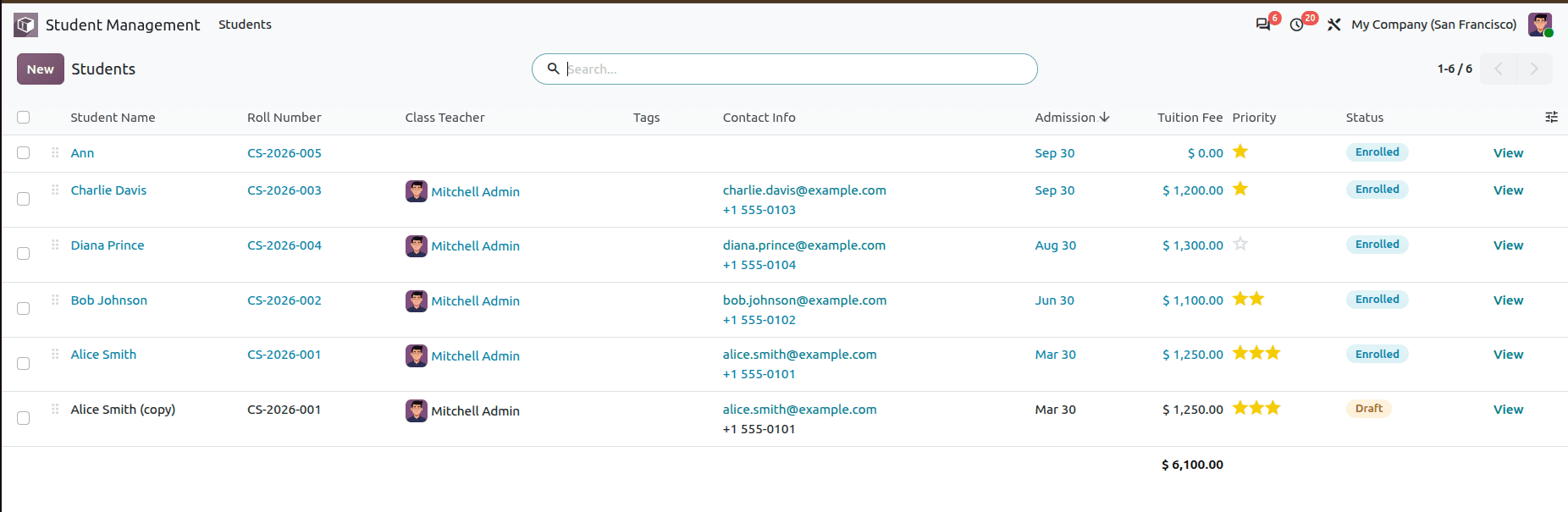
Odoo 20 List View provides great flexibility to the developers for making highly interactive, responsive and data-centric interfaces. The use of:
- Root attributes including editable, multi_edit, open_form_view, and permissions (create, edit, delete, export_xlsx),
- Interactive widgets including badge, priority, progressbar, boolean_toggle and many2one_avatar_user, and
- Optional columns ("optional=show"/"optional=hide") and advanced column grouping with ,
- will help you in achieving a highly intuitive user experience in Odoo 20.
To read more about How to Create Tree(List) View in Odoo 19, refer to our blog How to Create Tree(List) View in Odoo 19.